What Are Field Settings?

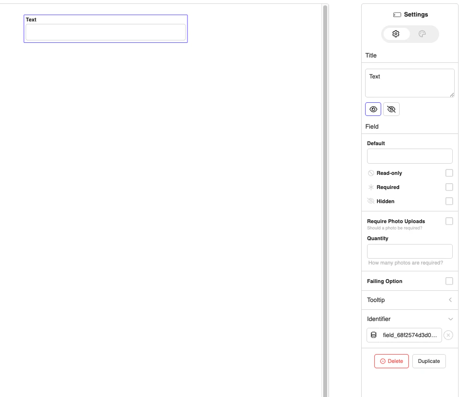
Field settings allow you to customize the form builder interface by:
  • Adding custom controls for data collection
  • Hiding unnecessary options to simplify the interface
  • Creating targeted settings for different field types
  • Collecting metadata for your business needs

Quick Start

import { JoyDoc } from '@joyfill/components';

function MyForm() {
  const fieldSettings = {
    // Your custom settings go here
  };

  return (
    <JoyDoc
      doc={yourDocument}
      mode="edit"
      fieldSettings={fieldSettings}
    />
  );
}

Understanding Targets

Targets determine where your settings appear in the form builder:
TargetScopeExample Use Case
fileEntire documentDocument metadata, global settings
pageSpecific pagePage sections, completion requirements
fieldAll field typesUniversal field behavior
text, number, dropdown, tableSpecific field typeType-specific settings
field_12345Individual fieldCustom field requirements

Setting Types

1. Identifier Settings

Predefined field identifier options with custom option support:
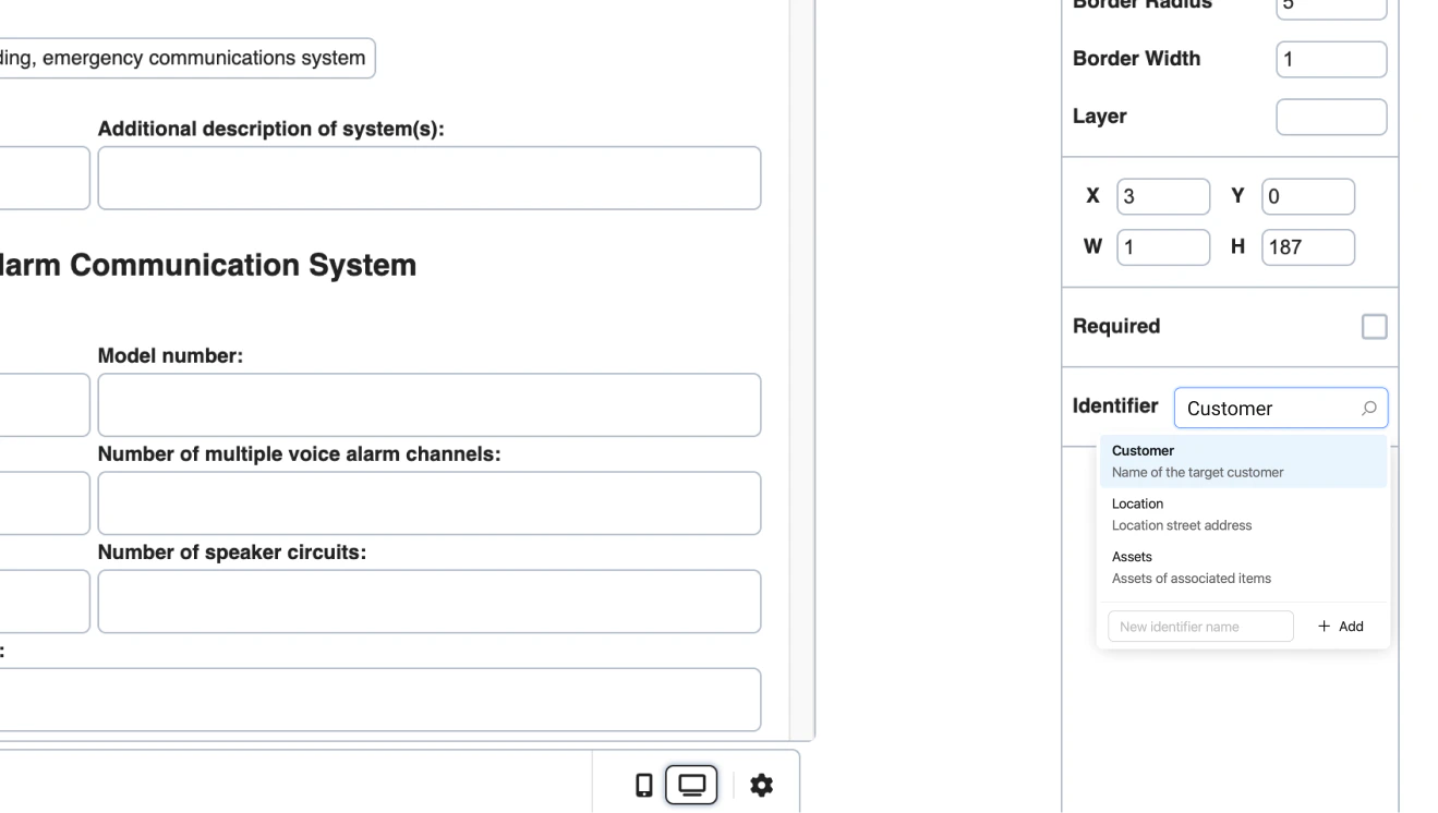
identifier: {
  label: 'Identifier',  // Custom label
  options: [
    {
      title: 'Plain Identifier Option',
      description: 'Identifier details for text',
      value: 'customer_text_customidentifierselector'
    }
  ]
}
Sample output:

2. Metadata Settings

Custom controls that save data to field metadata:
TypeUse CaseProperties
textShort textlabel, key, value, addon
textareaLong textlabel, key, value
numberNumeric valueslabel, key, value, addon
checkboxYes/No optionslabel, key, value
buttonActionslabel, key, color
dividerVisual separatorkey only
Metadata Example:
metadata: {
  options: [
    {
      type: FieldSettingsMetadataTypes.checkbox,
      label: 'Require Photo Uploads',
      description: 'Should a photo be required?',
      key: 'required'
    },
    {
      type: FieldSettingsMetadataTypes.number,
      label: 'Quantity',
      description: 'How many photos are required?',
      key: 'count'
    },
    {
      type: FieldSettingsMetadataTypes.divider,
      key: 'divider'
    },
    {
      type: FieldSettingsMetadataTypes.checkbox,
      label: 'Failing Option',
      key: 'fail'
    }
  ]
}
Output:

3. Table Columns Settings

Customize table field columns:
tableColumns: {
  types: ['text','dropdown', 'image', 'number' 'multiSelect', 'date', 'block', 'barcode','signature'],
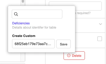
  identifier: {
    label: 'Col Identifier',
    options: [
      {
        type: 'text',
        title: 'Deficiencies',
        description: 'Details about identifer for table',
        value: 'table_customidentifierselector'
      }
    ]
  },
  metadata: {
    options: [
      {
        type: 'number',
        label: 'Require Photo Col',
        description: 'Should a photo be required?',
        key: 'required'
      }
    ]
  },
  options: {
    metadata: {
      options: [
        {
          type: 'checkbox',
          label: 'Failing Option',
          description: 'Trigger deficiency capture.',
          key: 'failure'
        }
      ]
    }
  }
}

Metadata for columns:

Custom column identifier
4. Options Settings

Customize dropdown/select field options:
options: {
  metadata: {
    options: [
      {
        type: FieldSettingsMetadataTypes.checkbox,
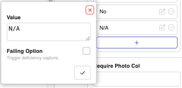
        label: 'Failing Option',
        description: 'Trigger deficiency capture.',
        key: 'failure'
      }
    ]
  }
}

Hiding Settings

Hide default settings by setting them to false:
const fieldSettings = {
  field: {
    title: false,        // Hide field title
    required: false,     // Hide required checkbox
    placeholder: false,  // Hide placeholder input
    styles: {
      fontSize: false,      // Hide font size
      fontColor: false,     // Hide font color
      backgroundColor: false // Hide background color
    }
  },
  page: {
    upload: false,      // Hide page background upload
    duplicate: false    // Hide page duplication
  }
};

Advanced Features

File Upload Handlers

onFileUploadAsync: async (params, fileUploads) => {
  console.log('onFileUploadAsync: ', params, fileUploads);
  return {
    _id: new Date().getTime(),
    url: 'https://s3.amazonaws.com/docspace.production.documents/6702de67c6ba43a423ca035f/documents/template_680bc498b6890a1324423764/680fbf96e97c7b42ec58f988-1745862550459.jpg'
  };
},
onFileClick: async (params, urlObject) => {
  console.log('onFileClick: ', params, urlObject);
},
onFileDelete: async (params, urlObject) => {
  console.log('onFileDelete: ', params, urlObject);
}

Global Settings

const fieldSettings = {
  autoResize: false, // Set to true to see supported fields auto resize
  field: {
    systemFilePicker: false   // Disable system file picker
  }
};

Complete Example

Here’s the exact fieldSettings example from JoyDoc.stories.js:
import React, { useState } from "react";
import { JoyDoc } from "@joyfill/components";
import FieldSettingsMetadataTypes from "../constants/FieldSettingsMetadataTypes";
import fieldColumnTypes from "../constants/FieldTableColumnTypes";

function CompleteFieldSettingsExample() {
  const [document, setDocument] = useState(initialDocument);

  const fieldSettings = {
    autoResize: false, // Set to true to see supported fields auto resize
    page: {
      metadata: {
        options: [
          {
            type: FieldSettingsMetadataTypes.checkbox,
            label: "Require Photo",
            description: "Should a photo be required?",
            key: "required",
          },
        ],
      },
    },
    field: {
      systemFilePicker: false,
      onFileUploadAsync: async (params, fileUploads) => {
        console.log("onFileUploadAsync: ", params, fileUploads);
        return {
          _id: new Date().getTime(),
          url: "https://s3.amazonaws.com/docspace.production.documents/6702de67c6ba43a423ca035f/documents/template_680bc498b6890a1324423764/680fbf96e97c7b42ec58f988-1745862550459.jpg",
        };
      },
      onFileClick: async (params, urlObject) => {
        console.log("onFileClick: ", params, urlObject);
      },
      onFileDelete: async (params, urlObject) => {
        console.log("onFileDelete: ", params, urlObject);
      },

      identifier: {
        label: "Identifier",
        options: [
          {
            title: "Plain Identifier Option",
            description: "Identifier details for text",
            value: "customer_text_customidentifierselector",
          },
        ],
      },
      metadata: {
        options: [
          {
            type: 'checkbox',
            label: "Require Photo Uploads",
            description: "Should a photo be required?",
            key: "required",
          },
          {
            type: 'number',
            label: "Quantity",
            description: "How many photos are required?",
            key: "count",
          },
          {
            type: 'divider',
            key: "divider",
          },
          {
            type: 'checkbox',
            label: "Failing Option",
            key: "fail",
          },
        ],
      },
      options: {
        metadata: {
          options: [
            {
              type: 'checkbox',
              label: "Failing Option",
              description: "Trigger deficiency capture.",
              key: "failure",
            },
          ],
        },
      },
      tableColumns: {
        types: [
          'text',
          'dropdown',
          'image',
          'number',
          'multiSelect',
          'date',
          'block',
          'barcode',
          'signature',
        ],
        identifier: {
          label: "Col Identifier",
          options: [
            {
              type: "text",
              title: "Deficiencies",
              description: "Details about identifer for table",
              value: "table_customidentifierselector",
            },
          ],
        },
        metadata: {
          options: [
            {
              type: 'number',
              label: "Require Photo Col",
              description: "Should a photo be required?",
              key: "required",
            },
          ],
        },
        options: {
          metadata: {
            options: [
              {
                type: 'checkbox',
                label: "Failing Option",
                description: "Trigger deficiency capture.",
                key: "failure",
              },
            ],
          },
        },
      },
    },
  };

  const handleChange = (changelogs, updatedDoc) => {
    console.log("Document changed:", changelogs);
    setDocument(updatedDoc);
  };

  return (
    <div style={{ padding: "20px" }}>
      <h1>Complete Field Settings Example</h1>
      <p>
        This example demonstrates the exact fieldSettings from JoyDoc.stories.js
      </p>

      <JoyDoc
        doc={document}
        mode="edit"
        fieldSettings={fieldSettings}
        onChange={handleChange}
      />
    </div>
  );
}

export default CompleteFieldSettingsExample;

Best Practices

1. Keep It Simple

Don’t overwhelm users with too many custom settings. Focus on what’s essential for your use case.

2. Use Clear Labels and Descriptions

Help users understand what each setting does with descriptive labels and helpful descriptions.

3. Provide Default Values

Set sensible defaults to improve user experience. Use dividers to organize settings logically.

Troubleshooting

Common Issues

Settings Not Appearing: Check your target syntax and ensure the field type matches. Metadata Not Saving: Ensure you’re using the correct key property and that it’s unique. Settings Hidden When They Should Show: Check for conflicting false values in your settings.

Summary

Field settings customization in Joyfill allows you to:
  • Add custom controls for your specific needs
  • Hide unnecessary options to simplify the interface
  • Target specific field types with specialized settings
  • Collect metadata for your business processes
  • Create a tailored experience for your users
The key is to understand your users’ needs and create settings that help them build forms more efficiently while collecting the data you need for your application. For more advanced customization options, refer to the official Joyfill documentation.